

Innovation programs love their vanity metrics. Idea submission counts. Workshop attendance numbers. "Innovation culture" scores that somehow measure creativity. CFOs keep asking the same question: what exactly are we getting for all this innovation spending?
After working with innovation teams across manufacturing, healthcare, retail, and professional services, I see the same disconnect everywhere. Teams celebrate 500 ideas submitted while executives wonder if the whole program justifies its budget. Innovation teams track activity while executives need economic proof.
The real problem isn't measuring more—it's measuring the right conversions. An idea moving from submission to implementation without clear economic validation is expensive guesswork. Track stage-by-stage conversion rates with expected value calculations, and suddenly you can predict returns before spending implementation budgets.
The broken funnel most innovation programs follow
Most innovation programs have predictable stages, but teams only measure entry and exit points. They know how many ideas come in, maybe how many get implemented. Everything between stays murky.
Here's what actually happens when you map the conversions:
Raw Submission → Initial Review (Conversion: 100%) Every idea gets reviewed, but this tells you nothing about quality. High submission with low downstream conversion usually means your intake criteria are too loose.
Initial Review → Validation Stage (Conversion: 15-25%) Most ideas die here because they lack basic feasibility. Survivors have clear problem statements, rough cost estimates, identified stakeholders. Below 15% suggests being too conservative. Above 30% suggests weak screening.
Validation → Business Case Development (Conversion: 40-60%) Ideas reaching validation passed basic sniff tests. Now they need numbers. About half have economics justifying deeper analysis. The rest usually fail on implementation cost, not potential value.
Business Case → Pilot Approval (Conversion: 30-50%) Even with solid business cases, resource constraints kill half the ideas. Portfolio management matters here. Too many teams approve pilots based on individual merit without considering total resource allocation.
Pilot → Full Implementation (Conversion: 60-80%) Pilots that launch usually succeed, though "success" gets defined loosely. Below 60% suggests flawed pilot design or unclear success criteria.
Implementation → Measurable Impact (Conversion: 70-85%) Not every implementation delivers projected value. Markets change, adoption lags, benefits take longer to materialize.
Calculating expected value at each stage
Most programs wait until implementation to calculate value. By then, you've spent the money. Smart programs calculate expected value at every stage, adjusting for probability of success.
Capture, evaluate, and act on ideas without friction.
GoIdeafy streamlines the entire innovation lifecycle from idea submission to implementation.
- Centralized idea capture
- Collaborative evaluation tools
- Progress tracking & analytics
No credit card required
Stage 1: Raw Idea Submission
Formula: Potential Value × Industry Success Rate × Fit Score
-
Industry success rate for similar initiatives
15%
-
Fit score based on company capabilities
0.6
-
Expected value
$2M × 0.15 × 0.6 = $180,000
At submission, you're working with massive uncertainty. A submitted idea for "AI-powered inventory optimization" might project $2M annual savings. But at this stage:
Stage 2: Post-Validation
Formula: (Validated Value × Probability of Technical Success × Probability of Adoption) - Estimated Costs
-
Validated value from pilot data
$1.5M (lower than initial estimate)
-
Technical success probability
70% (based on IT assessment)
-
Adoption probability
80% (based on stakeholder interviews)
-
Implementation cost
$200,000
-
Expected value
($1.5M × 0.7 × 0.8) - $200,000 = $640,000
After validation, you have real data. That inventory optimization idea now has:
Stage 3: Post-Pilot
Formula: (Proven Value × Scale Factor × Adoption Rate) - Actual Costs
-
Proven value from pilot
$300,000 annualized (on limited scope)
-
Scale factor to full implementation
4.5x
-
Observed adoption rate
75%
-
Remaining implementation cost
$150,000
-
Expected value
($300,000 × 4.5 × 0.75) - $150,000 = $862,500
Pilot results provide real evidence:
Stage 4: Full Implementation
Formula: Actual Measured Value - Total Program Costs
-
Measured annual value
$1.1M
-
Total program costs (including failures)
$280,000
-
Net value
$820,000 first year
No more probability calculations—just real numbers: Notice how expected value evolved: $180k → $640k → $862k → $820k actual. The progression shows increasing confidence with each stage.
Time-to-implementation as a hidden metric
Most teams track whether ideas get implemented, not how fast. But implementation speed dramatically affects ROI. An idea worth $100k annually that takes 18 months delivers far less value than one worth $80k that launches in 3 months.
Time-Adjusted Value = (Annual Value × Implementation Probability) / (1 + Monthly Delay Cost)^Months
Where Monthly Delay Cost represents your cost of capital plus opportunity cost, typically 1-2% monthly.
Example comparison:
Idea A: Quick Win
-
Annual value
$80,000
-
Implementation probability
85%
-
Time to implement
3 months
-
Monthly delay cost
1.5%
-
Time-adjusted value
($80,000 × 0.85) / (1.015)^3 = $65,044
Idea B: Big Project
-
Annual value
$120,000
-
Implementation probability
65%
-
Time to implement
12 months
-
Monthly delay cost
1.5%
-
Time-adjusted value
($120,000 × 0.65) / (1.015)^12 = $65,291
Despite 50% higher potential value, Idea B barely beats Idea A when you factor in implementation time and probability. Teams pick Idea B based on raw value and wonder why innovation ROI disappoints.
A real innovation funnel: From submission to economic impact
A mid-sized logistics company tracked all ideas through their innovation program over 6 months, revealing actual economics.
The Initial Idea: Route Optimization Using Driver Feedback
An operations manager noticed drivers constantly deviate from planned routes based on real conditions—construction, traffic patterns, delivery windows. What if we captured these deviations to improve route planning?
Stage 1: Submission (Day 1)
-
Potential value estimate
$3M annually (fuel, overtime, customer satisfaction)
-
Initial probability assessment
20% (unproven concept)
-
Expected value
$600,000
-
Decision
Move to validation
Stage 2: Validation (Days 15-45)
-
30-day manual pilot with 12 drivers, tracking deviations and reasons
-
Actual fuel savings
8% on tracked routes
-
Overtime reduction
1.5 hours per driver per week
-
Validated annual value
$1.8M (lower than estimated)
-
Technical feasibility
75% (requires dispatch system integration)
-
Expected value
$1.8M × 0.75 = $1.35M
-
Validation cost
$15,000
-
Decision
Develop business case
Stage 3: Business Case Development (Days 46-75)
-
Detailed implementation plan
-
Technology cost
$180,000 (software development and integration)
-
Training cost
$25,000
-
Annual operating cost
$35,000
-
Implementation timeline
4 months
-
Risk-adjusted value
$1.8M × 0.75 - $240,000 = $1.11M year one
-
Decision
Approve pilot
Stage 4: Pilot Program (Days 90-180)
-
Rolled out to 25% of fleet (30 drivers)
-
Measured savings
$385,000 annualized
-
Driver adoption
78% consistent usage
-
Technical issues
15% of routes failed to optimize properly
-
Scaled projection
$385,000 × 4 × 0.85 = $1.31M
-
Pilot cost
$65,000
-
Decision
Full implementation
Stage 5: Full Implementation (Days 181-300)
-
Complete fleet rollout
-
Actual measured savings
$1.24M annually
-
Final implementation cost
$215,000
-
Adoption rate
72% (slightly lower than pilot)
-
ROI
476% first year
Stage 6: Sustained Value (Months 12-24)
-
After one full year
-
Cumulative savings
$1.24M
-
Additional efficiency gains from refinement
$180,000
-
Total program cost (including failed ideas)
$340,000
-
Net innovation program ROI
318%
They tracked 47 other ideas through the same funnel. Only 6 made it to implementation. The total program spent $340,000 to generate $2.1M in validated annual savings.
Below is a visual workflow of the funnel and economics.
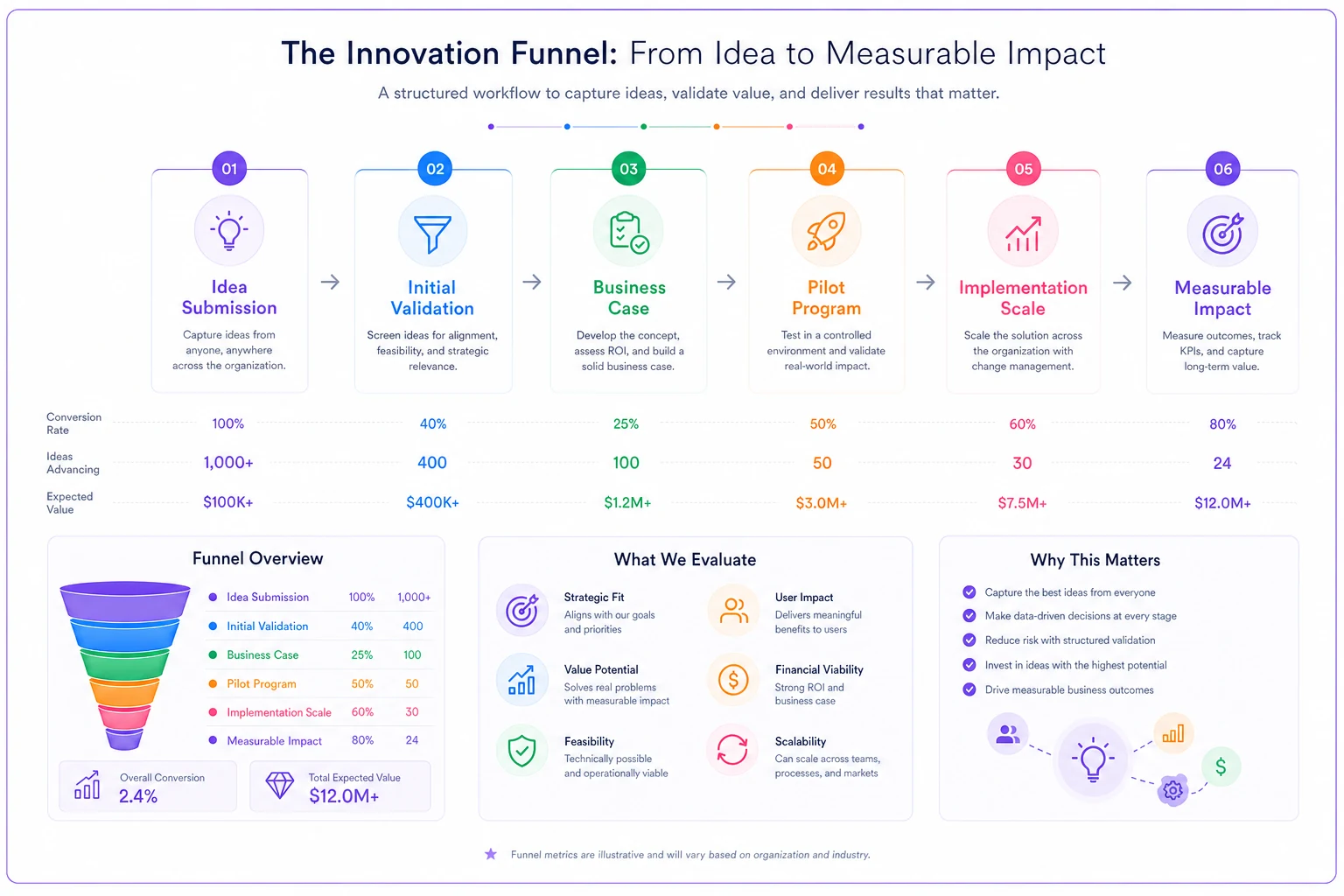
This illustration maps stages to conversion and expected value—use it in executive summaries to show how ideas progress.
Building an executive dashboard that actually gets used
Innovation dashboards fail when they show activity instead of value. Executives don't care about idea velocity or innovation index scores. They care about return on innovation investment.
Put Time to Value in the top-line metrics so executives see impact quickly.
Portfolio Overview (Top Section)
-
Active Ideas by Stage
Simple funnel showing count and total expected value at each stage
-
Investment vs. Return
Running total of innovation spend vs. validated returns
-
Time to Value
Average days from submission to implementation, trending over time
Economic Metrics (Middle Section)
-
Expected Portfolio Value
Sum of probability-weighted values for all active ideas
-
Realized Value YTD
Actual measured savings/revenue from implemented ideas
-
Innovation ROI
(Realized Value / Total Innovation Spend) × 100
-
Value at Risk
Expected value of ideas that might fail in next 90 days
Conversion Analytics (Bottom Section)
-
Stage Conversion Rates
Month-over-month comparison of conversion rates
-
Failure Analysis
Top 3 reasons ideas failed this quarter with counts
-
Speed Metrics
Ideas stuck in any stage >60 days with blockers identified
What to exclude from the dashboard
Don't waste dashboard space on:
-
Number of ideas submitted (quantity ≠ quality)
-
Employee participation rates (engagement ≠ value)
-
Innovation culture scores (subjective and unactionable)
-
Training hours completed (activity not outcome)
-
Number of patents filed (unless you're actually monetizing IP)
Innovation dashboards fail when they show activity instead of value. Executives don't care about idea velocity or innovation index scores. They care about return on innovation investment.
The operational reality of tracking innovation metrics
Setting up these metrics sounds straightforward until you try implementing them. Organizations face predictable challenges that kill measurement programs.
The first challenge hits immediately: nobody agrees on value calculations. Sales says an idea will generate $2M in new revenue. Finance says maybe $500k after factoring in cannibalization and implementation costs. Operations thinks the real benefit is efficiency, not revenue. Without standardized methodology, every idea becomes a negotiation.
The solution isn't perfect precision—it's consistent methodology. Pick a framework and stick with it:
-
Revenue ideas
Incremental revenue × gross margin × confidence factor
-
Cost reduction
Current cost × reduction percentage × affected scope
-
Efficiency gains
Time saved × loaded cost rate × adoption probability
The second challenge appears around month three: tracking fatigue. Initial enthusiasm for updating metrics weekly fades when people realize it's extra work with no immediate benefit. Ideas sit in stages without updates. Expected values never get revised. The dashboard shows stale data nobody trusts.
This is where automation becomes critical. Connect tracking directly to existing systems. When pilots launch, financial systems automatically track costs. When implementation completes, operational metrics feed directly into value calculations. Less manual updating means more sustainable measurement.
The third challenge emerges once you have good data: political pressure to make numbers look better. Innovation teams start inflating expected values to hit targets. Failed ideas get reclassified as "learning opportunities" and excluded from ROI calculations. Success criteria mysteriously change after pilots complete.
The only cure is transparency and consistent definitions established upfront. Publish the formulas. Lock success criteria before pilots start. Include all costs, even from failed ideas, in ROI calculations. When everyone knows the rules can't change mid-game, gaming becomes pointless.
Common formula mistakes that inflate innovation ROI
Even with good intentions, most organizations systematically overstate innovation returns through calculation errors.
Mistake 1: Ignoring the base rate When calculating expected value, teams forget that most innovations fail. They'll use 70% success probability because their specific idea seems strong, ignoring that 85% of similar ideas industry-wide fail. Always anchor probability estimates to relevant base rates, then adjust based on specific factors.
Mistake 2: Double-counting benefits An idea promises to reduce overtime costs by $200k and improve customer satisfaction. Teams value both benefits independently. But improved customer satisfaction often comes from the same faster service that reduces overtime. Count the primary benefit and note secondary benefits separately.
Mistake 3: Using gross values instead of incremental A new product innovation projects $5M in revenue. But it cannibalizes $3M from existing products. Real value is $2M incremental revenue, not $5M gross. Always calculate lift over baseline, not absolute values.
Mistake 4: Forgetting opportunity cost Every innovation resource allocated to one idea can't work on another. True cost isn't just the $100k you spend on a pilot—it's also the value of the best alternative idea you didn't pursue. Strong programs track a "killed idea bench" to understand opportunity costs.
Mistake 5: Stopping measurement too early Many innovations take time to deliver full value. A process improvement might show minimal impact in month one as people learn the new system, then accelerate in months 3-6. Conversely, some quick wins fade as old habits return. Track value for at least 12 months post-implementation.
When innovation metrics become operational intelligence
Real power emerges when innovation metrics stop being a reporting exercise and start driving operational decisions. Organizations that get this right use metrics to spot patterns others miss.
Tracking conversion rates by department reveals innovation capability gaps. If operations consistently converts 40% of ideas from pilot to implementation while IT only converts 15%, you've identified either a skills gap or resource constraint. The metric becomes diagnostic, not just descriptive.
Time-to-implementation metrics exposed bottlenecks in approval processes. One company discovered every idea requiring IT integration added 4.7 months to implementation time. They created a dedicated innovation IT resource and cut implementation time 60%. The metric revealed the constraint.
Expected value calculations help portfolio balancing. Instead of funding ideas based on political influence or presentation quality, teams can construct portfolios with appropriate risk/return profiles. Mix some quick wins (low value, high probability) with moonshots (high value, low probability) based on quantified tradeoffs.
Tracking failure reasons across all killed ideas surfaces systemic issues. When 30% of ideas fail due to "lack of stakeholder buy-in," you don't have an innovation problem—you have a change management problem. The pattern points to the solution.
This gets more powerful when you add AI automation to continuously analyze patterns. Instead of quarterly reviews where someone manually spots trends, AI agents flag when conversion rates drop, implementation times spike, or certain idea categories consistently underperform. The system learns what "normal" looks like and alerts when metrics drift outside expected ranges.
The executive dashboard in action: A sample view
Current Portfolio Status
-
Ideas in Pipeline
47 active across all stages
-
Total Expected Value
$8.7M (probability-weighted)
-
Investment to Date
$1.3M (65% of annual budget)
-
Realized Value YTD
$2.8M (validated and measured)
Stage Progression This Quarter
| Stage | Count | Expected Value | Avg Days in Stage | Conversion Rate |
|---|---|---|---|---|
| Validation | 18 | $980k | 22 | 24% |
| Business Case | 8 | $1.4M | 31 | 45% |
| Pilot | 5 | $2.1M | 67 | 68% |
| Implementation | 3 | $1.8M | 89 | 82% |
| Measuring Impact | 13 | $2.4M | 120+ | N/A |
Economic Performance Trends
-
Q1 ROI
156% (early implementations)
-
Q2 ROI
89% (heavy investment period)
-
Q3 ROI
178% (implementations completing)
-
Q4 Projected
215% (based on current pipeline)
Risk Indicators
-
Ideas Stuck >90 Days
6 (mostly in pilot approval)
-
Budget Utilization
65% with 3 months remaining
-
High-Value Ideas at Risk
2 worth $800k combined expected value
-
Resource Bottlenecks
IT integration (affecting 40% of active ideas)
This dashboard takes 5 minutes to review but provides everything executives need to make informed decisions about innovation investment allocation.
The difference between innovation theater and innovation value becomes crystal clear when you track these metrics consistently. Stop measuring activity and start measuring economic impact.
Ready to transform your innovation process?
Join 2,000+ companies using GoIdeafy to unlock team creativity, prioritize impactful ideas, and accelerate growth.