

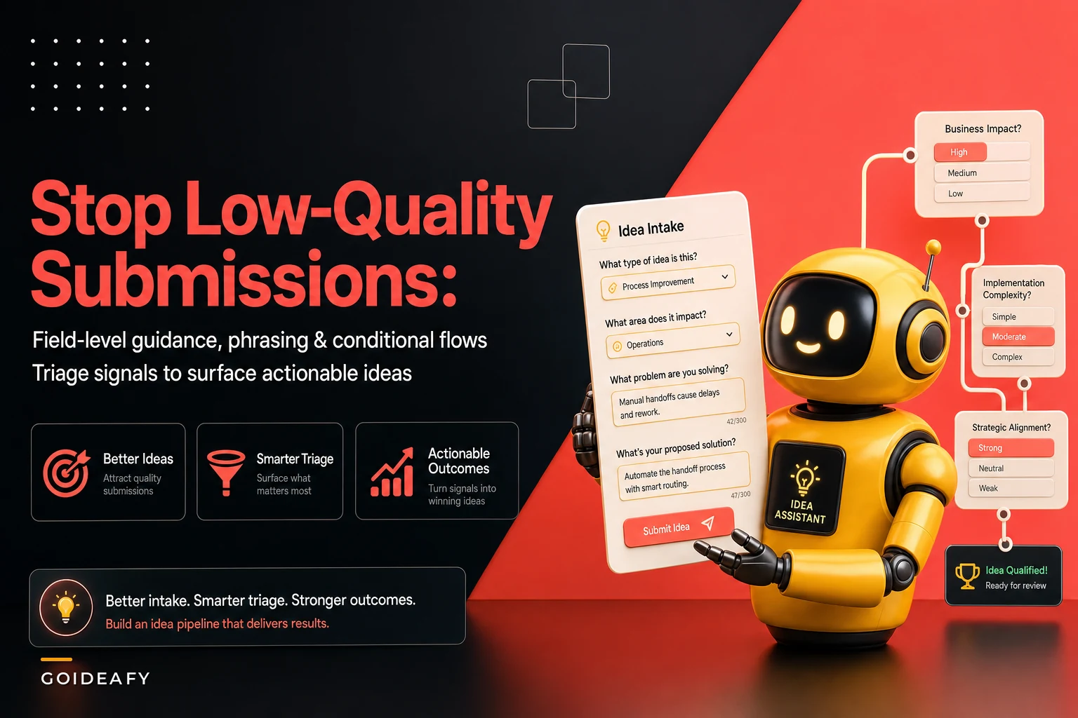

Most idea programs don't have a participation problem. They have a legibility problem. Submissions pour in, but half of them arrive as one-liners that could mean four different things, and evaluators end up spending their first ten minutes on every idea just figuring out what the person actually meant.
That's the real cost of a badly designed intake form. Not fewer ideas — worse ones. Or more precisely, ideas that might be good but arrive in a shape nobody can act on.
This post is narrow on purpose. It's about the form itself: which fields should be mandatory, which should stay optional, how conditional logic separates technical from non-technical submissions, and how the fields you collect map directly into triage signals downstream. Get this right and your evaluators stop doing archaeology.
The submission that wastes everyone's time
A field engineer submits: "We should automate the inspection reports." That's it. Title field filled, description field filled, hit submit.
Now the triage lead has a decision to make with zero context. Automate which inspection reports? For which team? Is this a workflow tweak or a new system? Has anyone tried it? What's broken with the current process? None of that is in the form, so the triage lead either sends it back — adds a week, kills momentum, and the submitter often never re-engages — or guesses and mislabels it, which costs a lot more when it lands with the wrong evaluator.
This usually happens for one reason: the form treats every idea as the same kind of thing. One description box, maybe a category dropdown, and a submit button. But a two-line process suggestion and a proposal to re-architect a data pipeline need completely different information to be evaluated. Asking for the same eight fields on both means the simple idea feels like a chore and the complex idea arrives half-empty.
The fix isn't more fields. It's the right fields, shown at the right time, with clear signals about what's required versus what's nice-to-have.
Mandatory vs optional: the line most forms get wrong
The instinct is to make everything mandatory because "then we'll have complete data." That backfires. Every mandatory field is a small tax on the submitter, and past a certain point people either abandon the form or type filler just to get past the required marker. You end up with complete-looking submissions full of "N/A" and "not sure."
Capture, evaluate, and act on ideas without friction.
GoIdeafy streamlines the entire innovation lifecycle from idea submission to implementation.
- Centralized idea capture
- Collaborative evaluation tools
- Progress tracking & analytics
No credit card required
The better principle: a field is mandatory only if triage genuinely cannot proceed without it. Everything else is optional, and you make it easy rather than required.
Here's how that split tends to shake out:
| Field | Status | Why |
|---|---|---|
| Problem statement (what's broken) | Mandatory | Triage can't route or prioritize without the problem |
| Proposed change | Mandatory | Distinguishes a complaint from an actionable idea |
| Who's affected / where | Mandatory | Drives ownership routing |
| Idea type (process / product / tooling / other) | Mandatory | Controls conditional logic downstream |
| Expected benefit | Optional but prompted | Useful for scoring, but submitters often estimate poorly |
| Effort guess | Optional | Non-technical submitters can't estimate this reliably |
| Supporting data / links | Optional | Strengthens strong ideas without blocking simple ones |
| Dependencies / systems touched | Conditional | Only relevant for technical ideas |
The pattern worth noticing: mandatory fields answer "can we route and rank this?" — not "is this a good idea?" Judging quality is the evaluator's job. Your form's job is to give the evaluator enough to start.
Pro-tip: make fields mandatory only when triage literally can't proceed without them.
One mistake that shows up constantly: making "expected ROI" or "estimated savings" a required field. Front-line submitters almost never have the data to answer honestly, so they either inflate it or quietly leave the program. Keep it optional, prompt for it gently, and let evaluators fill the gap during triage.
Conditional logic: split technical from non-technical early
This is where a static form and a smart form part ways. The same eight questions shouldn't appear for someone suggesting "let's move the weekly standup to Slack" and someone proposing "let's replace the batch ETL job with streaming."
-
Submitter selects idea type. This is the fork. Keep the options short: Process improvement, Product/feature, Tooling/technical, Other.
-
If non-technical (process, other)
show plain-language fields. "What's the current process?" "What would change?" "Who's affected?" No jargon, no effort estimates, no systems fields. Three or four questions, done in under two minutes.
-
If technical (tooling, product with a build component)
reveal the extra layer. "Which systems does this touch?" "Any known dependencies?" "Is this net-new or a modification?" "Rough complexity — a config change, a small build, or a large build?"
-
If "Other"
default to the non-technical path but add a free-text "help us categorize this" nudge so triage can reclassify.
Something most teams miss: conditional logic isn't just about hiding fields to make the form shorter. It's about capturing different signals for different evaluator paths. A process idea gets routed to an ops lead who cares about workflow disruption. A technical idea goes to an engineer who needs to know what systems are in play before they'll even look at it. If both submitters fill out the same form, one of those evaluators is always missing what they need.
A practical warning: don't nest branches more than one level deep. If selecting "technical" reveals a sub-question that reveals another sub-question that reveals three more fields, you've built a maze. One fork, a handful of revealed fields, done. Deep conditional trees look clever in the builder and feel awful to fill out.
A simple workflow of the conditional branching looks like this.
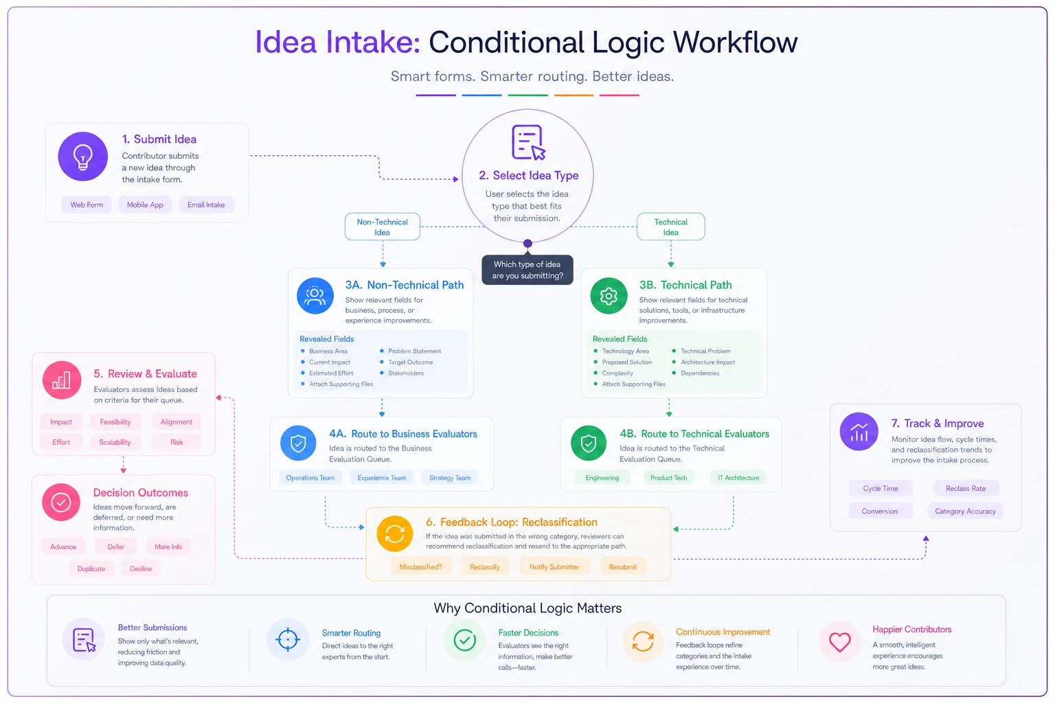
Keep the branch shallow and focused: one decision up front, a small set of fields revealed for each path, and clear routing rules so each evaluator gets the signals they need.
Example phrasing that actually pulls useful answers
Field labels do more work than people give them credit for. "Description" invites a shrug. A specific prompt invites a specific answer.
-
Weak "Description" → gets "Automate the reports"
-
Strong "What's happening today that shouldn't be, and what would you change?" → gets "We manually copy inspection data into three spreadsheets every Friday; I'd have it pull straight from the inspection app."
-
Weak "Benefit" → gets "It would help"
-
Strong "If this worked, what would be different — for you or the team?" → gets "The Friday copy-paste takes about two hours across the crew; that'd mostly go away."
-
Weak "Systems affected" → gets left blank
-
Strong "Which tools or systems would this touch? (even a rough guess helps)" → gets "The inspection app and whatever the reporting dashboard runs on."
The strong versions are conversational, they give an example inside the question, and they lower the stakes with phrases like "rough guess" or "even if you're not sure." People answer honestly when the question signals that a partial answer is welcome.
One more thing on phrasing. For the effort/complexity field on the technical path, avoid asking for hours or story points. Front-line submitters will either guess wildly or freeze. Offer three plain buckets — small tweak, some build work, major effort — and let the engineering evaluator convert that into a real estimate. You're capturing a signal, not a quote.
Downstream signal mapping: how form fields become triage decisions
Every field you collect should map to a decision the triage layer or evaluator makes. If a field maps to nothing, cut it. If a decision has no field feeding it, add one. Here's how the mapping typically runs:
-
Idea type → routing. Determines which queue and which evaluator group sees it first.
-
Who's affected / where → ownership. Determines the business unit or team lead who signs off.
-
Problem statement clarity → a rough quality signal. Sparse, vague problem statements can be auto-flagged for a "needs detail" nudge before they hit a human.
-
Systems touched (technical path) → dependency and duplicate detection. If three ideas all touch the reporting dashboard, that's a cluster worth grouping.
-
Complexity bucket → sequencing. "Small tweak" ideas can be fast-tracked; "major effort" ideas get parked for portfolio review.
-
Supporting data / links → confidence weighting. Ideas backed by data get a small nudge up the evaluation queue.
In practice: a submission comes in, the mandatory fields determine its route automatically, the conditional fields give the receiving evaluator the context specific to that idea type, and the optional signals inform prioritization without blocking anything from being accepted. The evaluator opens the idea and everything they need is already there.
This is also where AI-assisted intake can help quietly in the background. Modern operational platforms can read the free-text problem statement, suggest the likely idea type before the submitter even picks one, flag probable duplicates against the existing backlog, and pre-tag which team should own it. The submitter still controls the final answers — the automation just cuts the manual sorting that eats an evaluator's afternoon. Used well, it turns the intake form from a passive collection box into a first triage pass, so humans spend their judgment on the ideas that actually need it.
When a longer, stricter form actually makes sense
Not every program should chase the shortest possible form. There are cases where more mandatory fields are the right call:
-
High-stakes technical submissions where a bad route costs weeks. If a mislabeled idea burns a specialist's time, front-load the systems and dependency fields as mandatory on the technical path.
-
Regulated environments where you legally need consent, attribution, or IP fields captured at submission.
-
External or customer-facing intake, where you can't send an idea back for clarification as easily as with an internal employee.
When it's a bad idea: any internal, high-volume, low-stakes suggestion channel. If you're trying to build a habit of contribution — especially early in a program — a long mandatory form kills that habit faster than almost anything else. Shorter form, smarter conditional logic, optional depth.
Who should not add more fields at all: teams currently getting few submissions. If participation is the bottleneck, adding required fields is solving the wrong problem. Fix the form's friction and the trust issues first, then tighten fields once volume is healthy.
A real scenario: the intake redesign
A mid-sized logistics company ran an internal idea program with a single-page form: title, category dropdown, and one big description box. Everything mandatory, which sounds fine until you look at what actually came out of it.
Over a quarter they collected around 180 submissions. The triage lead estimated that roughly 40% needed a follow-up email just to become intelligible — what team, what system, what problem exactly. Those follow-ups added five to eight days per idea, and a good chunk of submitters never replied, so those ideas quietly died. Evaluators were spending more time clarifying than evaluating.
They rebuilt the intake around three ideas: a short mandatory core (problem, proposed change, who's affected, idea type), a conditional technical branch, and optional prompted fields for benefit and data. They also rewrote every field label into a plain-language question with an example baked in.
The next quarter, submission volume held steady — a little higher, actually, since the non-technical path felt lighter. The share needing clarification follow-ups dropped to around 12%. Technical ideas arrived with systems and complexity already tagged, so they landed with the right evaluator on the first pass instead of bouncing. The triage lead's clarifying-email time fell by more than half. No dramatic revenue number to attach to it — just a program where ideas moved instead of stalling, and evaluators who stopped dreading the queue.
A checklist before you ship your intake form
Run through this before you push a new or revised form live:
-
[ ] Every mandatory field answers "can we route and rank this?" — not "is this good?"
-
[ ] No field asks front-line submitters for data they can't reasonably have (hard ROI, hours, story points)
-
[ ] Idea type appears early and drives the conditional branch
-
[ ] Technical and non-technical paths show genuinely different fields, not the same ones reworded
-
[ ] Conditional branching is one level deep, no mazes
-
[ ] Every field label is a specific question, ideally with an example inside it
-
[ ] Optional fields are prompted and framed as low-stakes ("rough guess is fine")
-
[ ] Every collected field maps to a real downstream decision — cut the ones that don't
-
[ ] Someone who's never seen the form can complete the non-technical path in under two minutes
These aren't nice-to-haves. If you're skipping two or three of them, you probably already know which submissions keep coming back for clarification.
Closing thought
The quality of what lands in your idea program is set the moment someone hits submit — and that moment is entirely shaped by the fields you chose, the ones you made mandatory, and whether your conditional logic asked a warehouse supervisor and a data engineer the same lazy question.
Fix the intake and you're not just collecting cleaner data. You're changing where your evaluators spend their attention — away from decoding submissions and toward actually deciding which ideas deserve a shot. That's the whole point of a well-designed idea intake form: it does the first pass of the thinking, so the humans downstream can do the harder pass better.
Ready to transform your innovation process?
Join 2,000+ companies using GoIdeafy to unlock team creativity, prioritize impactful ideas, and accelerate growth.